Analytics
Insticator has designed the Analytics page to accommodate reports on all the products like Commenting, Trends and Reactions, Trivia and Polls, etc. The Analytics page provides a plethora of reports in a graphical format to depict various aspects of the products.
The global filters across all the Analytics features are as follows:
- Sort reports across all websites.
- Sort reports across all devices (mobile, web, or both)
- Sort reports across all countries.
- Sort reports for a given time period by selecting dates.
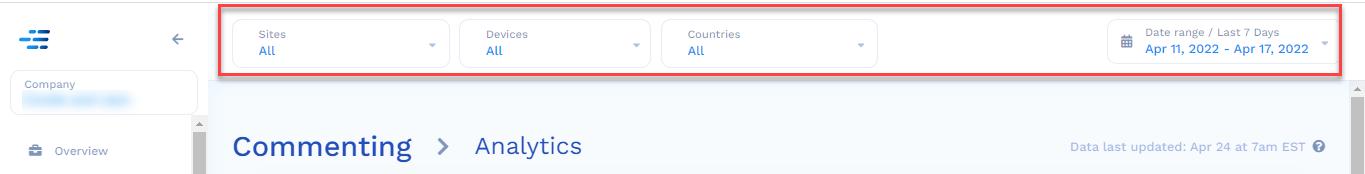
To access the Analytics for the Commenting unit,
- Navigate to Commenting > Analytics.
The reports that are generated for the Commenting unit are:
- Total Comments
- Commenting Users
- Total Commenting Reactions
- Top Articles by Engagement
- Commenting Beeline
- Emails Sent
All the reports are color-coded for ease of understanding. Each of these reports for the Commenting unit is mentioned in detail.
Total Comments
The Total Comments report includes counts of root comments, original comments from users, and replies.
The Average Comments per Unique User is calculated by taking the total comments (both root and replies) and dividing them by users who made at least one comment during the rolled-up time period.
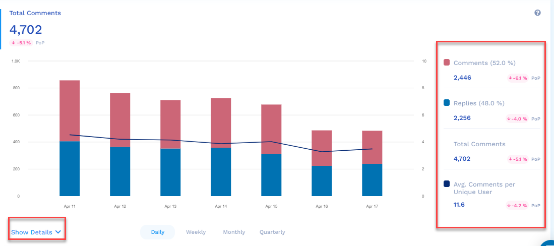
The features of the Total Comments report are:
- The red section of the graph is the number of comments over the selected period of time (by default, it is seven days, and the maximum is 30 days).
- The blue section of the graph is the number of replies over the selected period of time (by default, it is seven days, and the maximum is 30 days)
- On the right side, you will see the following color-coded analytics for the selected period of time (by default, it is seven days, and the maximum is 30 days):
Total number of comments
 Total number of replies
Total number of replies and comments (addition)
 The average comments made per unique user in the form of a line graph - The Show Details drop-down provides the Total Comment analytics for each day in tabular format.
- If you hover the mouse over each bar of the graph, the analytics for each bar/day is displayed on the right side of the graph.
Commenting Users
Unique commenting users are defined as a user making at least one comment for the selected rolled-up time period.
To calculate the Avg Time on Site Uptick metric, we estimate how much additional time commenting users spend on the site for the rolled-up time period. The estimate is based on data from both known and unknown users.
The estimated reaction time is allocated as follows:
- Comment/Reply - 60 seconds,
- Reaction (vote/emoji) - 5 seconds,
- Load more comments - 90 seconds, and
- Show more replies - 60 seconds.
Once we have the total time, we divide the above number by taking the user groups of commenters and users who click load more comments/replies.
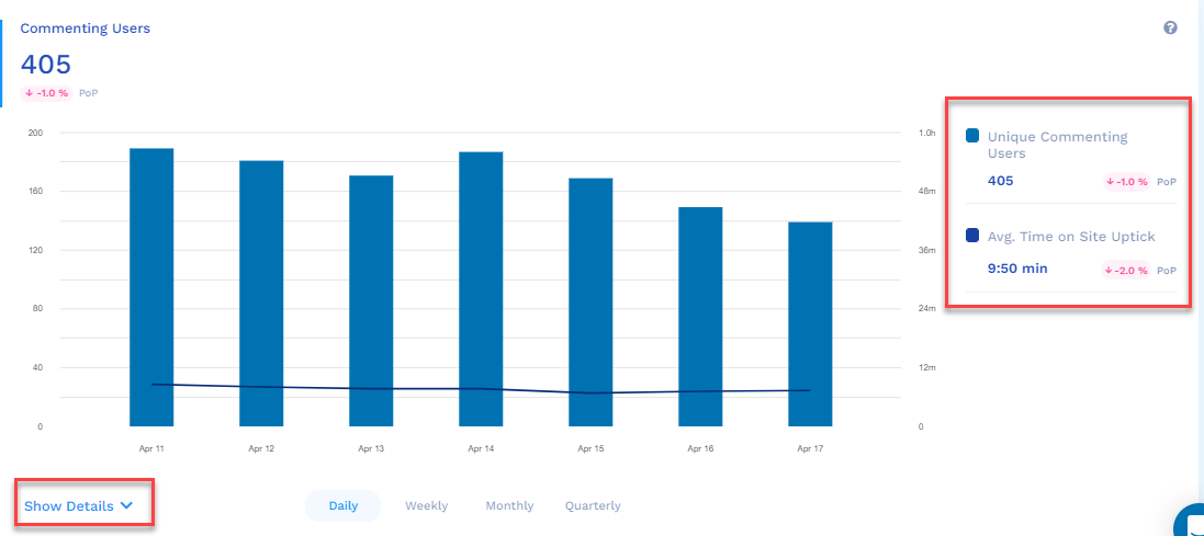
The features of the Commenting Users report are:
- The blue section of the graph is the number of unique commenting users over the selected period of time (by default, it is seven days, and the maximum is 30 days)
- On the right side, you will see the following color-coded analytics for the selected period of time (by default, it is seven days, and the maximum is 30 days):
The Total number of unique commenting users.
 The average time of a commenting user on a website in the form of a line graph - The Show Details drop-down provides the Commenting User analytics for each day in tabular format.
- If you hover the mouse over each bar of the graph, the analytics for each bar/day is displayed on the right side of the graph.
Total Commenting Reactions
Count of total commenting reactions across our eight default emojis. The average Reactions per Comment is calculated by taking all reactions for the rolled-up period and dividing that number by the total comments that received at least one reaction during that same time period.
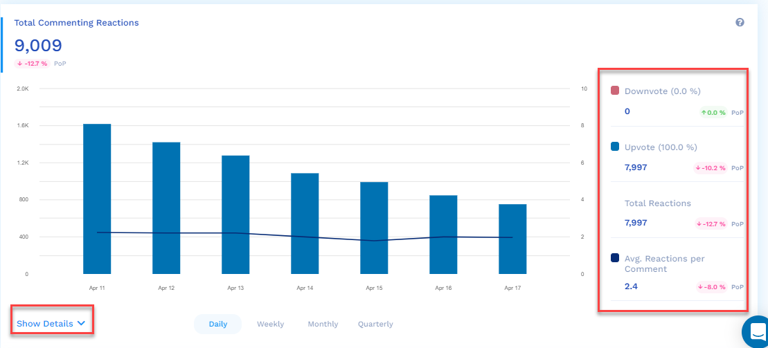
The features of the Total Commenting Reactions report are:
- The blue section of the graph is the number of Total Commenting Reactions over the selected period of time (by default, it is seven days, and the maximum is 30 days)
- On the right side, you will see the following color-coded analytics for the selected period of time (by default, it is seven days, and the maximum is 30 days):
Total number of comments that were downvoted
 Total number of comments that were upvoted
Total number of reactions
 The average reactions per comment in the form of a line graph - The Show Details drop-down provides the Commenting Reactions analytics for each day in tabular format.
- If you hover the mouse over each bar of the graph, the analytics for each bar/day is displayed on the right side of the graph.
Top Articles by Engagement
A list that ranks the top 20 articles that have the most engagement over the selected timeframe. Engagement is defined by summing each article's Root Comments, Replies, and Reactions. Note: the counts we show you in the table are for the time period only, not all of the engagement for the article since it was published.
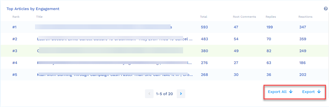
Click Export to export the reports to an excel sheet.
Commenting Beeline
Commenting Beeline is the icon that publishers put at the top of the page that gives a count of comments and links directly to the commenting unit. The average Percent of Visitors whose "Click" is calculated by taking the total number of clicks of the Commenting Beeline icon divided by the total number of commenting loads during that same period.
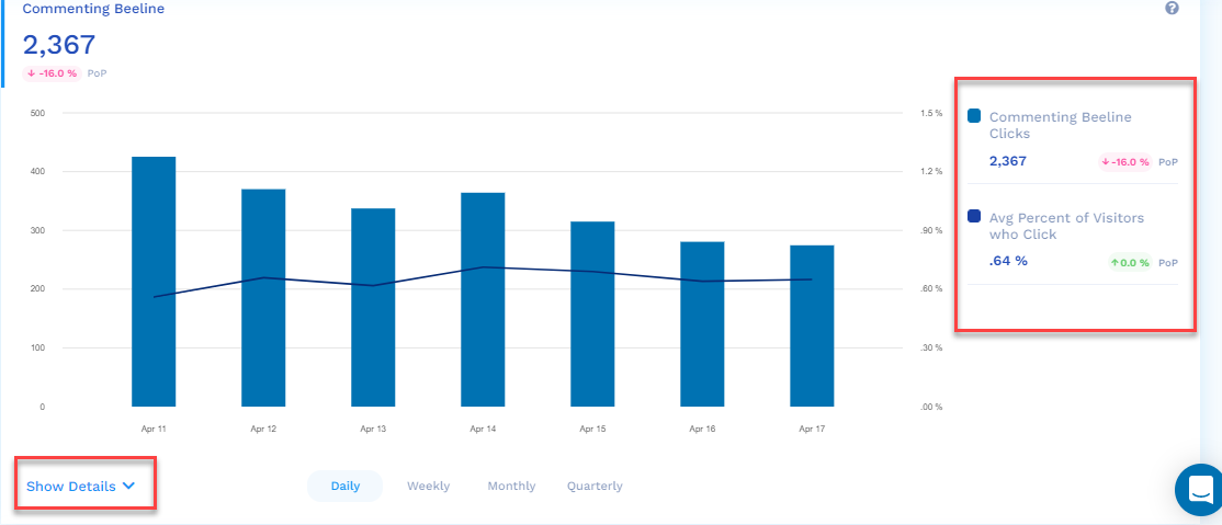
The features of the Commenting Beeline report are:
- The blue section of the graph is the number of Commenting Beeline Clicks over the selected period of time (by default, it is seven days, and the maximum is 30 days)
- On the right side, you will see the following color-coded analytics for the selected period of time (by default, it is seven days, and the maximum is 30 days):
Total number of Commenting Beeline Clicks
 The average percent of visitors who click in the form of a line graph - The Show Details drop-down provides the Commenting Beeline analytics for each day in tabular format.
- If you hover the mouse over each bar of the graph, the analytics for each bar/day is displayed on the right side of the graph.
Emails Sent
Users can enable notifications where we will send them emails to let them know when someone has responded to their comment. Within the email, we allow that commenter to click on a link that will take them directly back to the site and the commenting unit, which is the Returning Users Count metric.
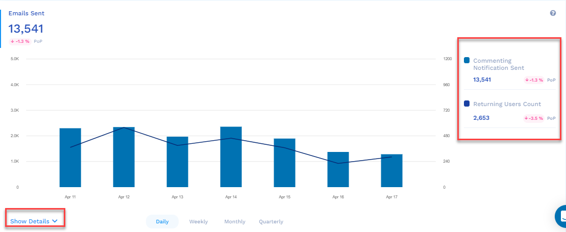
The features of the Emails Sent report are:
- The blue section of the graph is the number of Emails Sent over the selected period of time (by default it is seven days and the maximum is 30 days)
- On the right side, you will see the following color-coded analytics for the selected period of time (by default it is seven days and the maximum is 30 days):
Total number of Commenting notifications sent over email.
 The count of returning users in the form of a line graph - The Show Details drop-down provides the Emails Sent analytics for each day in tabular format.
- If you hover the mouse over each bar of the graph, the analytics for each bar/day is displayed on the right side of the graph.
Updated 9 months ago